Healthcare
Wraps up in 6 Minutes
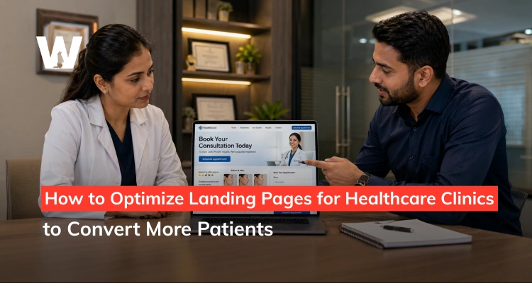
How to Optimize Landing Pages for Healthcare Clinics to Convert More Patients
Published On April 28, 2026
Wraps up in 6 Minutes
Published On April 28, 2026
You are spending on ads, your SEO is driving traffic, and your Google Business Profile is in good shape. But the appointments are not coming in the way the numbers suggest they should. Chances are that your landing pages are where those patients are quietly walking away.
Most healthcare clinic websites convert around 3% of their visitors. The top-performing medical service pages, built and optimized intentionally, reach 7.4% and beyond. That gap is not a traffic problem. It is a page problem.
A landing page in a healthcare context carries a weight that most other industries do not deal with. The visitor is not choosing a hotel or a subscription service. They are making a decision about their body, their health, or their appearance. Trust and clarity are not optional features - they are the whole game.
According to First Page Sage's 2026 benchmarks, healthcare landing page conversion rates sit at 3.0-4.2% on average, with top performers reaching 8-10% through deliberate optimization.
This guide covers what separates a clinic landing page that converts from one that politely loses patients to a competitor down the road.
The most common clinic landing page mistake is not a bad design or a weak offer. It is a mismatch between what the ad promised and what the page delivers.
A patient clicks an ad for "lip filler consultation in [City]" and lands on a homepage full of team photos and a general services list. The specific thing they were promised - a consultation for one specific treatment - has disappeared. So has their confidence that this clinic is the right choice.
This message-to-page mismatch is one of the most consistently cited causes of poor healthcare landing page performance. Patients bounce - not because they were not interested, but because the page did not confirm they were in the right place.
As Healthcare Success highlights, the headline and subheadings must keep the promise made in the ad that brought the patient to the page. When they do not, patients bounce - not because they were not interested, but because the page did not confirm they were in the right place.
The second common failure is information overload. Clinic pages that list every service, introduce every team member, and link to every corner of the website give the patient too many decisions to make. In healthcare conversion, one page should have one clear purpose and one clear next action.
There is a reliable pattern behind landing pages that convert well in healthcare - and it has nothing to do with how impressive the design looks. It has everything to do with how clearly and quickly the page answers the patient's three unspoken questions: Is this for me? Can I trust this clinic? What do I do next?
The hero section - the first thing a visitor sees without scrolling - determines whether the rest of the page gets read at all. A headline like "Relief from Hair Loss, Without Guesswork" speaks directly to the patient's emotional state. A headline like "Welcome to [Clinic Name] - Leaders in Advanced Aesthetic Medicine" speaks to the clinic's ego.
The best-performing clinic hero sections combine a patient-outcome headline, a brief supporting sentence that adds credibility, and a single CTA button above the fold. Nothing else is needed at this stage.
Imagery in the hero section should feature real patients or clinical environments - not stock photos of models or generic "healthcare blue" graphics. Patients in the consideration stage are subconsciously evaluating whether this clinic reflects their own situation.
Trust signals are the elements on a landing page that tell a patient, before they have spoken to anyone, that it is safe to take the next step. In a healthcare context, these carry more weight than in almost any other category.
Patient testimonials with names and treatments mentioned perform better than anonymous quotes. Before-and-after results (with signed patient consent) placed near the consultation form consistently lift conversion.
Accreditations, certifications, and media mentions placed near the CTA reduce the final hesitation that stops a near-converted patient from submitting their details.
We've seen clinics double their form completion rate simply by moving a cluster of Google review quotes from the bottom of the page to directly beside the booking form. Proximity to the conversion action matters.
81% of users abandon a form after starting it. Every additional field you add beyond what is strictly necessary increases that drop-off.
According to 2026 landing page conversion research, reducing fields to five or fewer can double completion rates. For most clinic bookings, a first name, phone number, email, treatment of interest, and a preferred time slot is enough to start the conversation.
The form headline matters too. "Book Your Free Consultation" converts better than "Contact Us" or "Get in Touch." Name the action, name the benefit, and remove every field that is not essential to initiating contact.
For mobile visitors, form design needs extra attention. Tap targets should be large enough to select without zooming. Auto-fill compatibility reduces typing friction. A progress indicator for multi-step forms reduces abandonment.
A beautifully designed landing page that loads in five seconds is losing patients before a single word is read. Genesys Growth's 2026 research puts the cost of each additional second of load time at 7% in conversions.
For a clinic page receiving 500 monthly visitors, a 3-second improvement in load time can translate directly into 10-15 additional inquiry form submissions per month.
The most common speed culprits on clinic websites are uncompressed before-and-after images, video files loading directly on the page, and bloated page builders with excessive plugin overhead. These are fixable - but they require someone looking for them deliberately.
Mobile optimization goes beyond screen size. A page that is technically mobile-responsive can still convert poorly if the CTA button is buried below the fold, the form fields are too small to tap accurately, or the phone number is not click-to-call enabled.
In 2026, more than 60% of clinic website traffic arrives on mobile. Optimizing for mobile is not a UX nicety - it is a direct line to more booked appointments from the patients who are already finding you.
| Common Problem | Impact on Conversions | Fix |
|---|---|---|
| Uncompressed images | Increases load time by 2-4 seconds | Compress all images to under 200kb before uploading |
| Video autoplay on page load | Delays interaction and drains mobile data | Use a thumbnail with a play button and load the video only after user click |
| CTA below the fold on mobile | Patients leave before seeing the CTA | Add a sticky CTA bar at the bottom of the mobile screen |
| Non-click-to-call phone number | Mobile friction reduces incoming calls | Wrap the phone number inside a tel: href link |
| Too many form fields | Can lead to an 81% form abandonment rate | Limit forms to 5 fields: name, phone, email, treatment, and preferred time |
| No SSL certificate | Browser security warnings instantly reduce trust | Ensure https:// is active on all landing page URLs |
Source: Genesys Growth 2026 Landing Page Research; Landingi Healthcare Landing Page Best Practices 2026; Wolfable clinic CRO audit data.
Bottom Line: Speed and mobile experience are not technical problems that marketing teams can hand off and forget. They are conversion problems - and they compound every day they go unfixed.
One of the clearest patterns in clinic conversion optimization is the performance advantage of dedicated, treatment-specific pages over general services pages. Clinics pursuing a greater variety of landing pages consistently outperform those sending all traffic to a single contact page or services hub.
This has been confirmed by Runner Agency's 2026 research found that clinics pursuing a greater variety of landing pages and lead generation options consistently outperform those sending all traffic to a single contact page or services hub.
The logic is straightforward. A patient researching "FUE hair transplant" and landing on a dedicated FUE page converts at a significantly higher rate than the same patient landing on a general "Hair Restoration Services" page.
The dedicated page can address specific treatment information, realistic result timelines, FAQs about recovery, and a form tailored to where the patient is in their hair loss journey - none of which a general page can do well.
Each treatment-specific page also creates a separate SEO asset. A page titled and optimized for "PRP hair treatment [City]" can rank independently in Google search and capture patients further along in the decision process, without competing for the same keyword space as your general clinic homepage.
This is an area where we see compounding returns for clinic clients over time. The more precisely each page matches a patient's specific search intent, the higher the quality of the lead that page generates.
Our guide on SEO strategy for aesthetic clinics covers how treatment-specific page architecture supports both organic visibility and conversion performance simultaneously.
The call to action on a clinic landing page is where the entire page's work either pays off or does not. And yet most clinic CTAs are painfully generic.
"Contact Us," "Learn More," and "Get in Touch" tell the patient nothing about what they are about to do or why they should do it now. A specific, benefit-named CTA removes that hesitation.
| Treatment Type | Weak CTA | High-Converting CTA |
|---|---|---|
| Lip filler | "Contact Us" | "Book Your Free Lip Filler Consultation" |
| Botox | "Learn More" | "Claim Your Complimentary Botox Assessment" |
| Hair transplant | "Get in Touch" | "Book a Free Hair Loss Assessment Today" |
| Laser hair removal | "Request Information" | "Get Your Personalized Laser Treatment Plan" |
| Skin rejuvenation | "Send a Message" | "Book Your Skin Consultation - No Obligation" |
| Dental implants | "Contact the Clinic" | "Find Out If Implants Are Right for You" |
Source: Wolfable clinic CTA optimization framework; Genesys Growth 2026 personalization and CTA performance data.
Bottom Line: Personalized CTAs convert 202% better than generic ones. In healthcare, the specificity of the action directly reflects the specificity of the clinic's understanding of what that patient needs.
A homepage is designed to introduce a brand. A landing page is designed to convert one specific visitor with one specific intent. Sending paid ad traffic to a homepage wastes budget by forcing a patient - who clicked on a specific ad for a specific treatment - to hunt for the information that should have been waiting for them on arrival.
Every paid campaign should land on a dedicated page that mirrors the ad's promise, speaks to that treatment specifically, and has one clear next action.
Stock photography of stethoscopes, blue-gloved hands, and symmetrical faces communicates nothing meaningful about your clinic. Patients in the consideration stage are subconsciously evaluating whether this clinic and its team feel like a genuine, trustworthy environment.
Real photos of your clinic space, your actual team, and (with consent) real patient results communicate far more trust than any stock image library. This is one of the lowest-cost, highest-impact changes a clinic can make to a landing page.
Only 17% of marketers actively A/B test their landing pages, despite testing producing an average 37% improvement in conversion rates. For a clinic page receiving meaningful monthly traffic, testing one element at a time - the headline, the CTA colour, the form placement - compounds small gains into significant improvement over a few months.
And the upside is significant: Genesys Growth's 2026 research found that companies with 40 or more landing pages see 500% more conversions than those with five or fewer.
A patient who fills in a consultation form and does not hear back within a few hours is likely to book elsewhere. Some studies suggest only one in nine healthcare inquiries becomes an actual patient - partly because of slow or inconsistent follow-up.
Landing page optimization does not stop at the conversion. An automated confirmation email, a fast phone follow-up, and a clear next step communicated immediately after submission are all part of the conversion journey.
Landing page optimization is one of the areas where we see the fastest measurable returns for clinic clients, because the changes are often structural rather than expensive. A headline rewrite, a form repositioned next to a testimonial cluster, and a page speed fix can shift conversion rates within weeks.
We've worked with aesthetic, hair restoration, and medical clinics where the traffic numbers looked healthy but the consultation pipeline was thin. In almost every case, the landing pages were losing patients at the decision point - not because the clinic was the wrong choice, but because the page was not making a clear enough case at the right moment.
Our in-house team - including CRO specialists, copywriters, UX designers, and SEO strategists - approaches clinic landing pages from all sides simultaneously. Copy, layout, speed, mobile experience, and form design are reviewed together, because they all affect the same patient at the same time.
If your clinic is also thinking about how landing page performance connects to your paid search and local visibility strategy, our guide on Local SEO for aesthetic clinics covers how your organic and paid presence feed the same patient journey - and why the landing page is the critical link between them.
If your clinic is spending on ads or investing in SEO and the appointments are not reflecting it, the issue is rarely that you need more traffic. It is that the traffic you already have is not being given a good enough reason to convert.
Landing pages are not a set-and-forget asset. They are living documents that need clear headlines, well-placed trust signals, short forms, fast load times, and CTAs that name the action the patient is about to take.
The clinics that consistently outperform their competition in digital patient acquisition are not always the ones with the biggest ad budgets. They are the ones that have built a page experience where clicking on an ad leads to a page that makes booking feel like the obvious next step.
If you are ready to start turning your existing traffic into more consultations, our team can audit your current landing pages, identify where patients are dropping off, and build a conversion optimization plan that fits your clinic's specific treatment mix and patient profile.
You can also explore how landing page strategy connects to your broader marketing approach through our content marketing guide for aesthetic practices and our social media playbook for aesthetic clinics.